
Microsoft Developer Portal Illustration System
01 / SERVICESILLUSTRATION
DESIGN SYSTEM
STYLE GUIDE
While working within Microsoft’s Developer Division, I built a scalable illustration system for use on the developer portal as part of an organization-wide initiative to unify brand expression across Microsoft’s family of developer platforms and products.
02 / CONTEXTProject background
The Microsoft developer portal provides project-based access to development tools and resources that are stored and managed from the cloud.
The Azure UX team needed an initial suite of spot illustrations that they could use for visual storytelling and in-product experiences across the newly-redesigned portal.
Design strategy
To provide their team with a solution that could scale with their needs, I built a procedural illustration system in Figma – with documentation providing a clear design framework, style guide, and centralized toolkit – to ensure longevity, fidelity, and brand alignment as this family of spot illustrations continually expands.

03 / PROCESS
I partnered with the Azure UX team to design and develop this illustration system over the span of a few months, using a phased approach that involved multiple cycles of iteration, team review, and testing.
Once illustrations were approved, I created a centralized library in Figma where I defined technical specs like component variables, properties, and styles – with documentation – so future system updates and additions to the library can be published procedurally while lowering design overhead.
04 / ILLUSTRATION ELEMENTS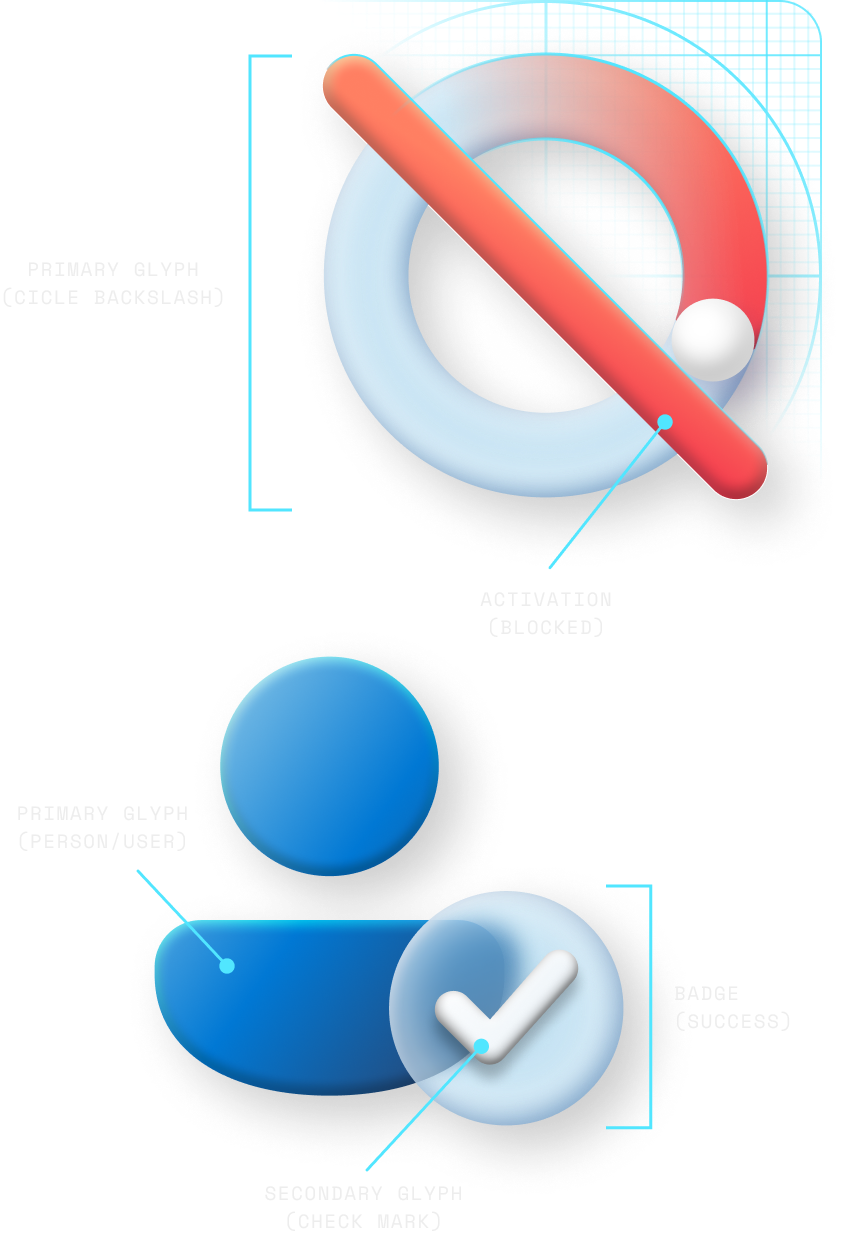
I built each illustration using the same general combination of components – starting with a primary glyph that is layered with few additional elements to create a simple, beautiful, and unified system of illustrations that are legible and delightful.
Primary glyph: Main component / conceptual foundation of the illustration. This element should serve as the focal point of the illustration, providing context for additional visual elements or components.
Secondary glyph: Symbols used to communicate more complex ideas – ranging from abstract to literal.
Badge: Supportive visual elements that communicate the status of an object, person, environment, or action.
Activation: Dynamic components that communicate various states of activation (i.e. wifi connectivity, being blocked, etc.)
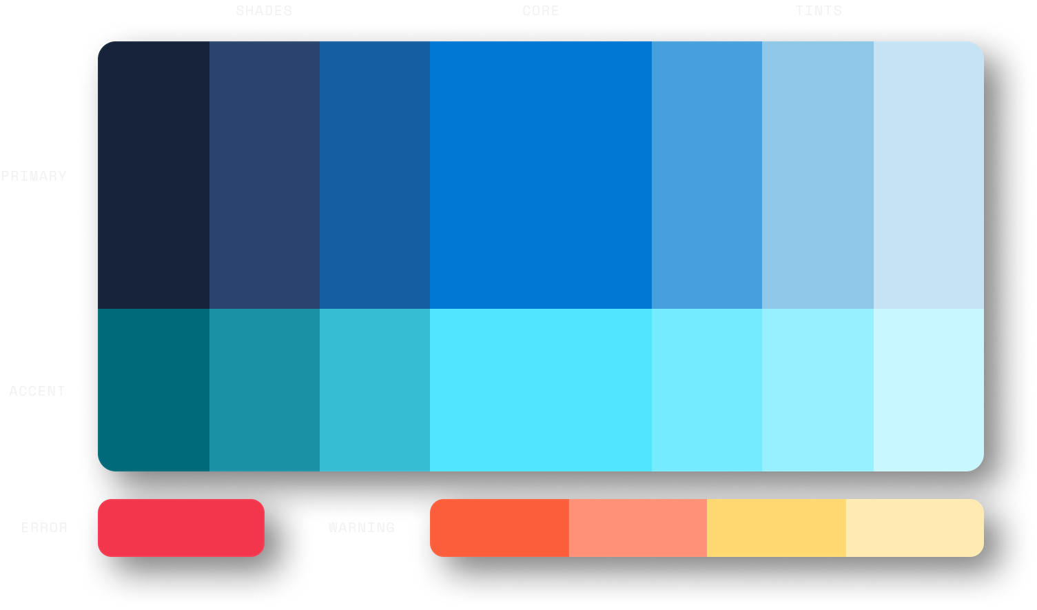
Colors & Materials
I created component styles using a strategic use of color, tint, and material effects in both light and dark mode for optimal contrast, legibility, and clarity of expression.
Building these illustrations using styles and color tokens in Figma enables cascading style changes across the entire system, drastically lowering design overhead by eliminating the need to make individual updates to illustrations.
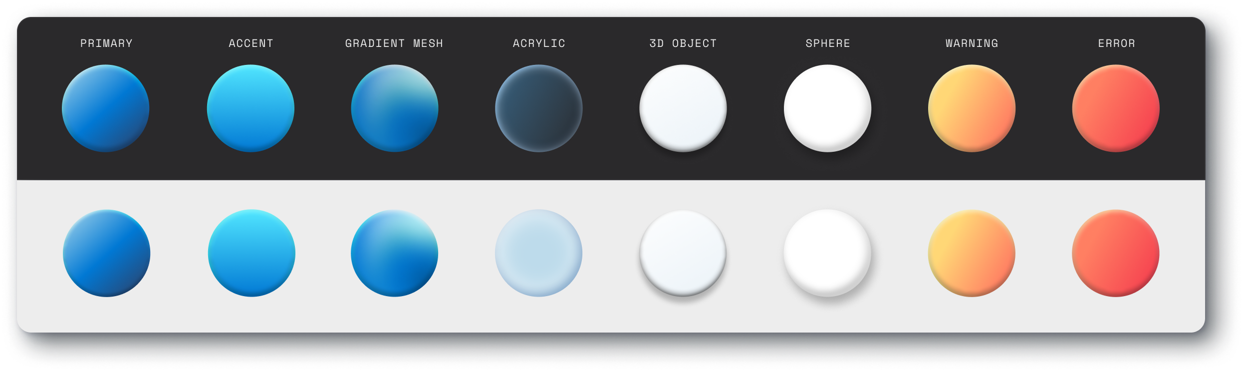
Acrylic effect
Achieving an acrylic glass effect in Figma is pretty simple when using background blur, unfortunately this effect isn’t supported in SVG.
To work around this, I duplicated the objects that were behind the acrylic element, masked them, and blurred them to get the same effect.


05 / EXPLORATIONWhile working on this project, there were a few stylistic pivots that needed to happen in order to ensure that this illustration system not only met Microsoft’s global brand guidelines, but also aligned with industry standards for accessibility and web performance.
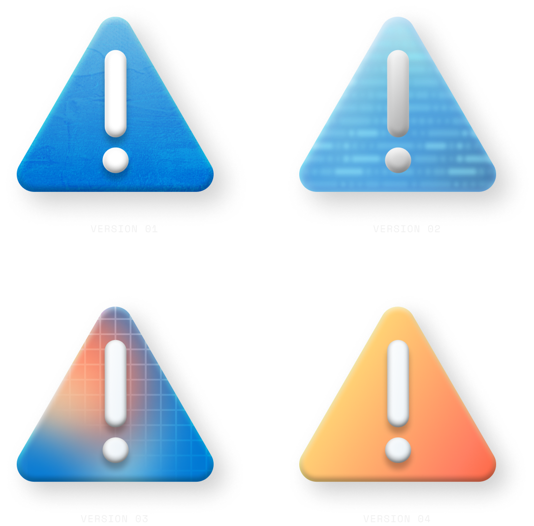
Texture & pattern evolution
My initial explorations included the use of textures and patterns as supportive expressive elements intended to convey a certain tone for individual illustrations while creating unity across the system.
Further testing revealed the following:
Additional textures yielded larger file sizes despite optimizing them for SVG format
Certain textures didn’t pass Microsoft accessibility contrast requirements
Complex textures were more labor intensive to replicate – with fidelity – at scale

Debossed vs Acrylic
This debossed treatment was an emerging style of expression that was being integrated into other areas of Microsoft’s global brand, however it presented several concerns around accessibility and scalability.
After several rounds of testing, we ultimately decided to pivot to acrylic materials instead because it was higher contrast, simpler to replicate, and felt stylistically aligned to Microsoft’s developer audience.
06 / ILLUSTRATION SYSTEM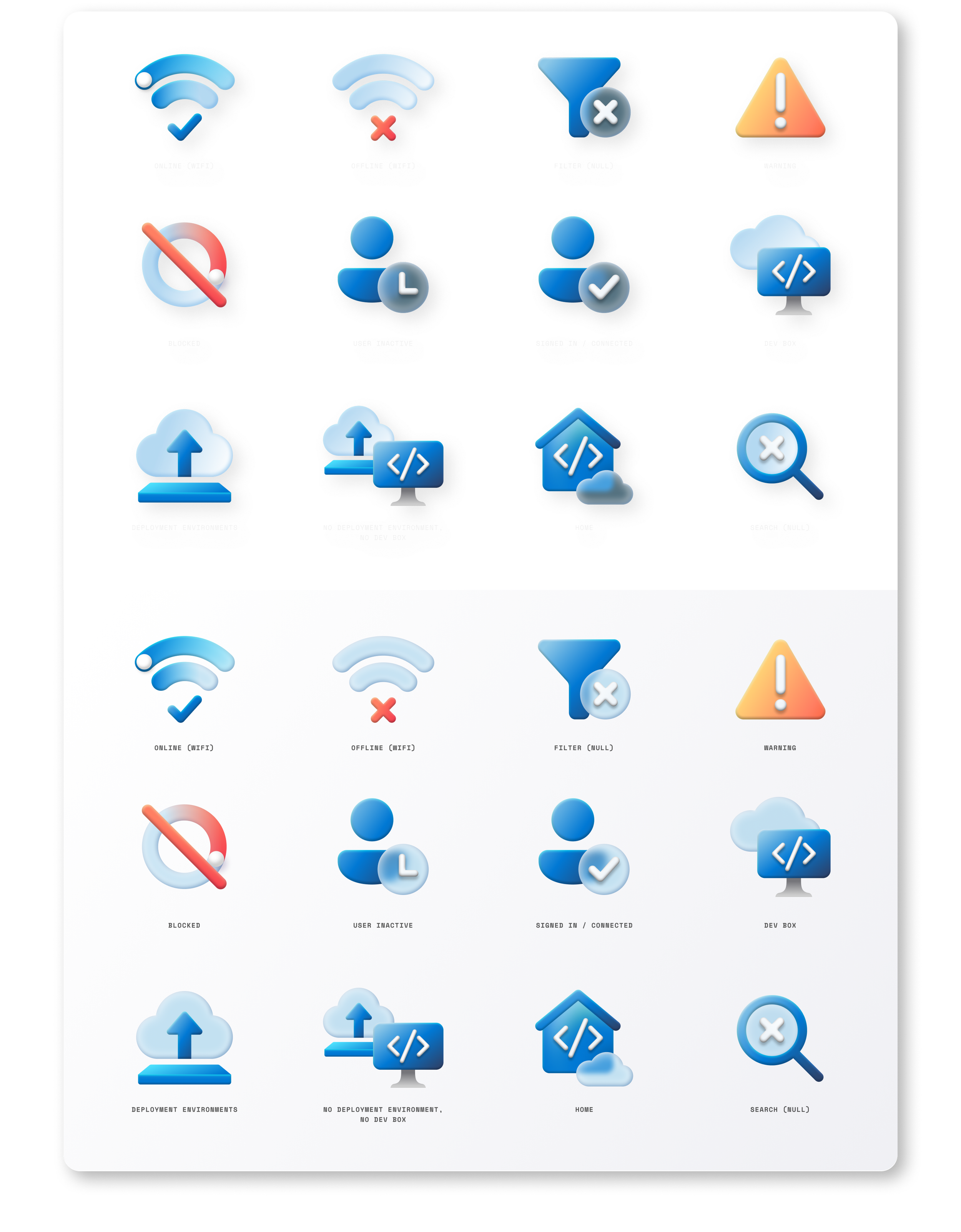

07 / OUTCOMEI executed this illustration system ahead of the developer portal launch to ensure ample time for testing. This ultimately led to an even better solution – and happier clients. 🎉
The success of this project couldn’t have been achieved without close collaboration with the Azure UX team, direct and candid communication between stakeholders, and a mutual dedication to creating exceptional experiences for Microsoft developers.