
People’s Memorial
Logo Refresh
01 / SERVICESLOGO DESIGN
IDENTITY
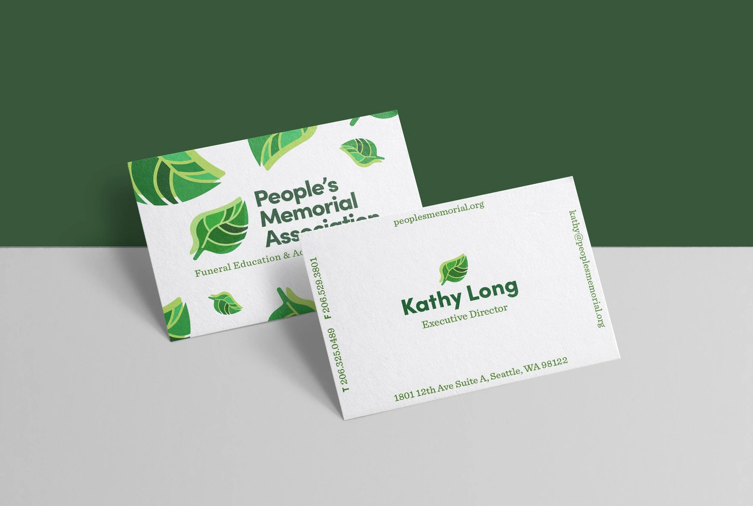
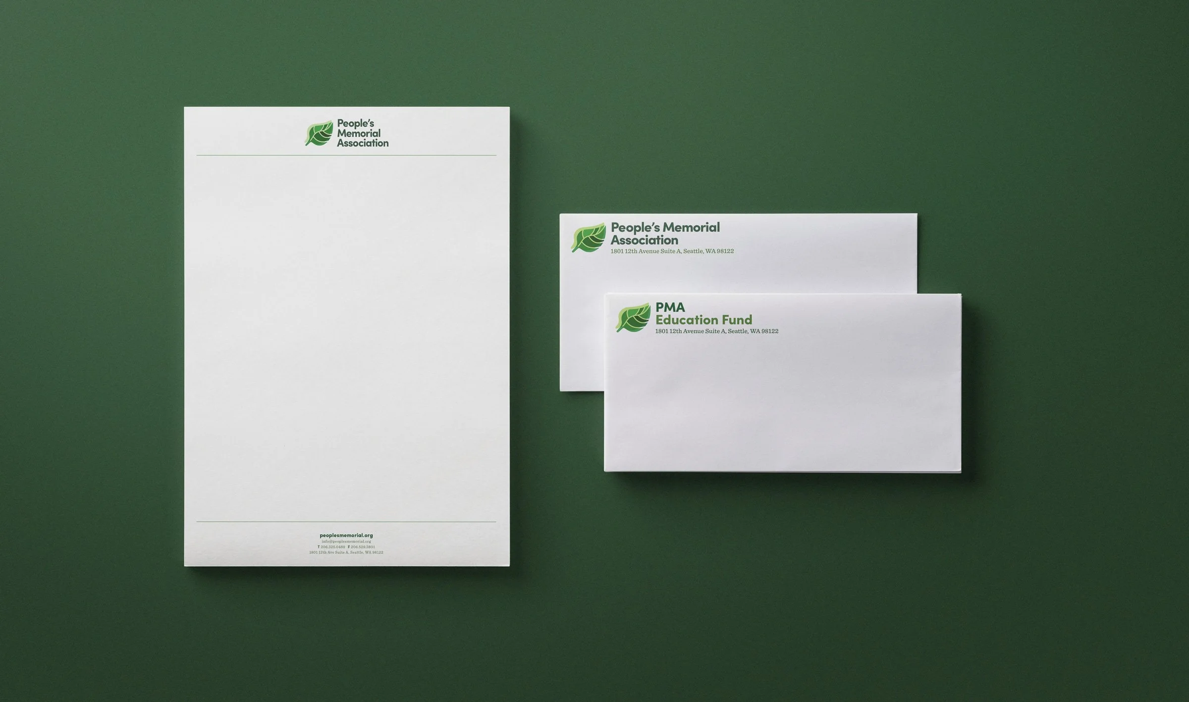
PRINT
Founded in Seattle in 1939, People’s Memorial Association is a Washington State nonprofit that offers a full range of services including end-of-life planning, educational workshops, and advocacy for transparency and awareness while consumers navigate the funeral industry.
02 / CONTEXTProject background
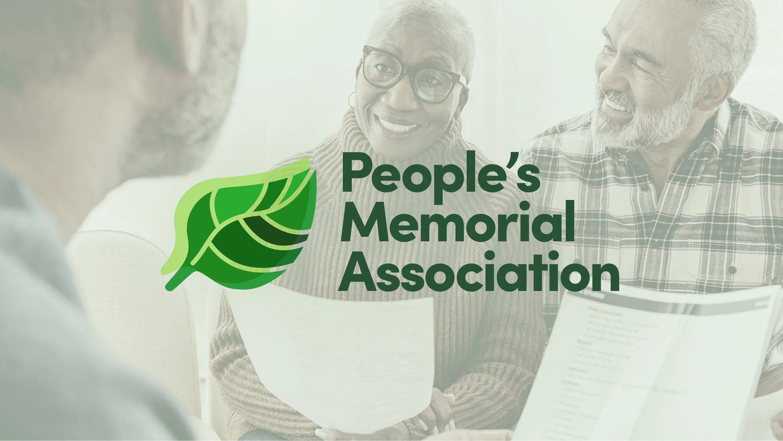
People’s Memorial Association wanted a logo refresh – a new mark that felt contemporary, friendly, and reflected their core values as educators and innovators within the funeral industry, championing environmentally sustainable end-of-life practices.
Design approach
I worked with the Executive Director to design a new logo and simple identity that they could use across their business collateral and website. This project had a quick turnaround due to budget constraints, so our collaboration needed to be strategic and efficient.
03 / PROCESSGrounding with research
Admittedly, before this project I knew very little about the funeral industry. That said, it was evident that People’s Memorial occupied a unique niche within the nonprofit sector, so I got to work getting to know my client, asking about about their customers’ needs, and doing an independent deep dive on the funeral industry to learn what makes People’s Memorial stand out as an organization.
Insights & considerations
Many people are unprepared around time of loss due to lack of adequate planning and communication with their loved ones
Most people aren’t aware of the many financial resources and environmentally sustainable accommodations available to them
Cultural fears and misconceptions around death and dying prevent people from engaging in proactive end-of-life planning
04 / EXPLORATIONI developed multiple directions for the new logo that combined my research findings with specific design parameters and brand strategy expressed by client at People’s Memorial.
All directions feature a flexible logo mark with multiple lockups ensuring their brand can easily scale with their needs, across all organizational collateral.
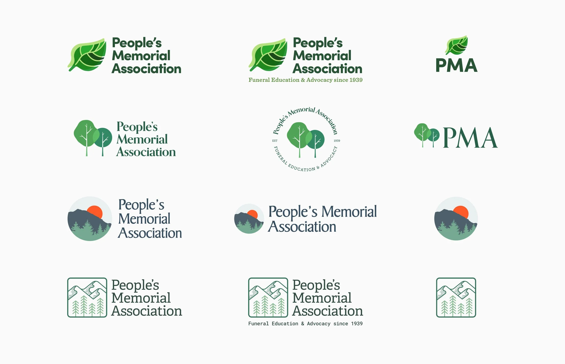
05 / BRAND REFRESHMy client and I reviewed each direction at length, and she ultimately chose the final direction that she felt best represented the core values of People’s Memorial, and embodied the spirit of their organization’s mission to educate and serve the diversity of Washington State’s residents with dignity and care.

Concept
This direction features an abstract depiction of a leaf at various stages in its lifecycle. The mosaic visual treatment represents the different seasons of life and how they fit together to create a unified whole – a layered metaphor that is intended to embody diversity, unity, connection, sustainability, and the cycle of life.
People’s Memorial doesn’t want to be seen as the last step in a painful process – instead, they want to position themselves as eco-conscious industry leaders and educators who are dedicated to serving their community with dignity, transparency, and respect.
Innovative
Affect positive change to benefit funeral consumers with accessible, efficient, and quality memorial services.
Sustainable
Conserve resources and respect the environment to ensure affordability and long-term viability.
Compassionate
Seek to understand the circumstances and needs of families. Provide professional services that are supportive and caring.
Ethical
Maintain the highest standards. Transparency and accountability are integral to all aspects of our operations.
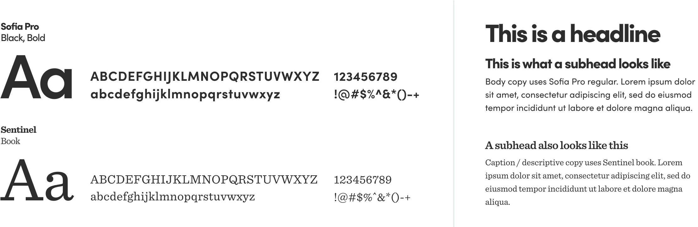
06 / COLORS & TYPOGRAPHY

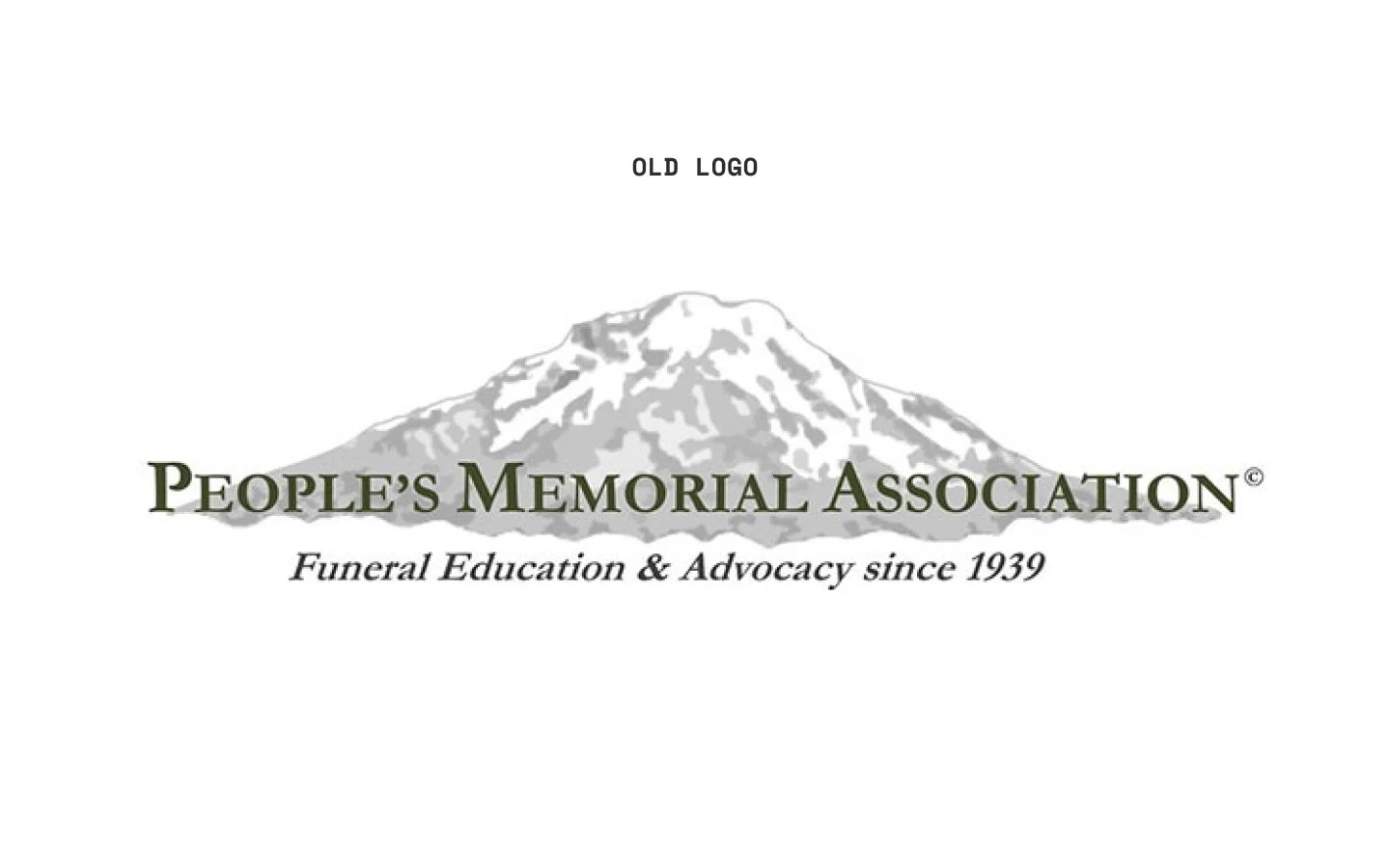
07 / OUTCOMEDespite the quick turnaround and limited budget, I managed to create a striking new logo and identity that my client felt successfully embodied the scope and mission of People’s Memorial. 🍃
Once the final direction was selected and approved, I delivered the new identity and worked with the Executive Director to translate it into creative assets that the organization could use to independently update their website and collateral.